• Beta
  • Open Beta Version 3.4.0

peter after reading your response i think you dont understand my issue with highlighting of first line, firstly i have nothing against highlighting,

i just dont want it to be active when it first loads a song.

The song has not started and i dont want to see highlighting of anything unless i Start the song or i start scrolling within the song,

it is as simple as that.

Reason i like to see a highlight when i start the song as it gives me visual reasurance the song has started

ST2 did this perfectly i could start the first line of programing of timecode [00.00.00] and no need to change anything for it to work correctly,

you have introduced a new feature that highlights lines as you scroll, this is also great, but it has upset the way the first line reacts to highlighting when a song is loaded surely there is something that can be reprogrammed to automatically retain the logic of ST2 loading of song logic yet give you this new wonderful feature immediately after Start or scroll has been activated.

    Hi Peter, i am sending you my thoughts of a simpler way of operating the multitrack it is only a vision to what i expect of todays software and the way things are going.
    1 simplicity
    2 everything in one place
    3 things laid out in very simple order of whats needed
    4 not doubling up on things you have to do
    Meaning i should not have to name a multi track song as i create it, it should just be a blank canvis, when you decide to load a folder in which your files reside and you have already spent time naming it by the songs name this should automatically place that song name in to ST3 multitrack song name , it should also automatically point you to that folder if you are loading individual files and with a click of an Load all button it should automatically load the first 6 tracks in that folder, making it very efficient, you only have to name the folder once and if you place the first six files in order of prefference they auto load in to the appropriate multitracks.
    Once everything is loaded and you want to clear the multitrack song you slide to the left to get delete and you can either leave all tracks alone and just change to another multitrach song folder to load or you can also choose Delete All this will empty everything to default, empty multitrack song without a name ready for a new load session. This then becomes a very quick way of loading and editing of multitrack songs,
    If its left comlicated and slow to use people will try it and go back to the simpler method.
    Creating multitracks is complicated as it is , transferring files made as easy as possible would ease the pain.
    Also using it on stage would be a much more pleasant experiance, i have recently researched the up comming compatition and must say they have grand ideas but still not one has hit the spot like ST3, i am seeing looping introduced which i was very surprised to see, but they all have missed the mark no one really knows how to create something thats user friendly, checkout WORSHIP BACKING BAND and see what i mean.
    Have a close look at all the buttons and labels.
    Cheers Damir
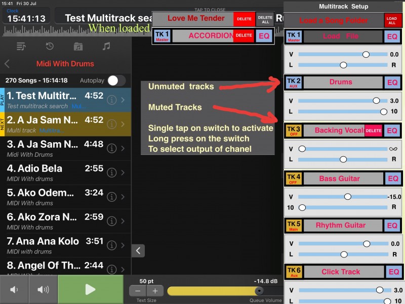
    Load All, when selected loads the first 6 files in the Song folder residing in ST3 Multitrac files folder to the 6 tracks in order of how they reside in the folder, and the ST3 multitrack that was created without a name is automatically named for you so there are no spelling differences and time is saved.
    Once everything is loaded and auto named you have an option to swipe left to either rename or delete this procedure.
    When Load All is NOT selected the Song files name is automatically entered in to the ST3 new multitrack song,No audio files are entered but this procedure has also created an automatic path to your folder where all the files reside, saving you time to search for the folder and giving you options to all the files to choose to place for that track, to load a track you simply tap the tracks and name it, an empty track would be named Load a File since it is empty and would be darker or lighter in colour whichever you think works better, and once the file is entered it is auto named to its file name and the area it resides changes colour to indicate it is loaded and active,
    Muting a track does the same it changes the colour of the muted track using the same logic to make it stand out less as it is not in use.
    Swipe to left to delete or rename this track once loaded.
    EQ is self explanitory it should pop up to the same screen area give you all the EQ settings in one screen no need to scroll and have an exit button on it to get back to multitrack view, EQ to also have a compare button that acts like an undo redo function.
    A tap on the outside of this screen area immediately exits all screens and gets you back in to performance mode.
    If you are in i call it normal mode which is song list on left and lyrics window right, when you choose multitrack edit or even EQ settings in stereo mode the pop up window shoul be top to bottom view using all the screen realestate and it should automatically retract the song list column and shift it to the left so you can still see the lyrics.

    STOP!!!

    I just had a brain fart!

    why are you dropping anything over the lyrics, this is totaly useless when performing, yet you have a song list area that is not useable and unimportant to you at that time while you are tweaking things, it would make more sense to have all popup windows go in to that area,
    Why didnt we think of this in the first place, why hide the one thing we are still using when performing live and thats the lyrics screen, it makes no sense.So i would suggest all pop up windows fill the song list area and adjust themselves to the view ratio that a person has scosen, these pop up windows should all be top to bottom to maximise the realestate view.
    Thats it for now.

      DickyDutch In this case (ie when user doesn’t want to use the Queue function) to avoid confusion would be better to Grey this setting and default it to 0.0db?

      I don't think so. Because if you load a song from a playlist, the queue volume will be set to that of the playlist. Let's say it is a background music playlist with low volume. Now when you load a song from the songs tab, the queue volume will stay at the previous setting. So when the volume slider would be disabled, you would have no way to change the volume expect changing song volume which will in turn mess up your loudness matching between songs.

      Damir i just dont want it to be active when it first loads a song.

      There is a simple solution for this: Change the timecode to [00:00.01]

      Damir i am sending you my thoughts of a simpler way of operating the multitrack it is only a vision to what i expect of todays software and the way things are going.

      Thanks, but as I already wrote a couple of times, I am not going to change UI or functionality at this point.

      New build 6968

      I think this is it, beta version #5 and the final release candidate for version 3.4.0. I am already working on the documentation and will submit the final version to Apple as soon as the documentation is finished.

      Changed

      • Removed support for opening Word documents on MacOS
      • Removed setting to disable highlighting when playback is stopped
      • Errors during audio engine startup will no longer be displayed in dialog but logged to the system log

      Fixed

      • Midi commands not sent after rewinding a song
      • Crash when changing routing or soloing a track and no song is loaded into the player
      • Fixed equalizer reset not affecting playback
      • Fixed wrong value after double tap on mid high bandwidth equalizer slider
      • Autplay button not updating setting in playlist

      But if you saying that when a song is loaded from the songs tab that the queue volume is really the last playlist volume why don’t you call it playlist volume? In my opinion when a user chooses not to use the Queue function and eliminates it from view (via settings) the reference to ‘Queue’ should then never appear anywhere in the user Interface.

        DickyDutch But if you saying that when a song is loaded from the songs tab that the queue volume is really the last playlist volume why don’t you call it playlist volume?

        Because it would not change the volume of any playlist. Even though you do not see the queue tab, it is still working in the background. And the volume you change is really that of the queue. It would wrong naming it playlist volume.

          peter I feel the same way but i understand Peters problem, all he has done is hidden the Queu, but he is still using it in the background, this fools you to think its out of the picture but its not.

          The proper way to do it is once you hide queu is make the software act like ST2 use to be, and queue is gone completely and reduces any confusion , this is probably a much harder job to do.
          I am not a fan of queu but i can work with it the way it is hidden specially now the faders automatically change to what you are doing.
          I prsonally think there is a good compromise where the two systems can take the best of both and have only one method of operation to avoid any confusion i will write my thoughts in a nother post.

          Hi Peter, sorry to keep interrupting you efforts to bug test but perhaps have a quick think of what i am pointing out and see if you can bennefit to improve ST3 further.
          Here is my latest thought,
          It actually makes me wonder why didnt we do this in the first place as operationally it makes much more sense than the current system, and its to do with drop down windows when editing SONG EQ, MULTITRACK SETUP, SONG PROPERTIES, all these windows when enabled block the lyrics WHY?
          Since you cant do anything with the rest of the interface while in these windows and your performance is running why block the lyrics it makes more sense to use the left SONG list area leaving the lyrics still visible so once you have tweaked your settings touch the lyrics screen and you are back to normal with minimal interference to you.
          It makes so much sense i cant believe it wasnt like that already.
          Here is my latest layout of what im talking about, with the other two windows doing the same thing.

            One more remark about queue volume. In version 2 all songs had to be in a playlist in order to be played. So it makes sense that there is always a playlist volume present. In version 3 you can play songs from the song list which is not a playlist. If I rename the queue volume to playlist volume when the queue tab is disabled I know I will get support requests asking why playlist volume changes don't affect the playlist. For example if you load a song from the song list but navigate to a playlist where this song is also added to, it will be marked blue. Now if the volume slider was named playlist volume you would most likely expect this playlist volume to be changed which is not the case. That's more confusing than keeping the slider named queue volume.

            Damir This is actually a very good observation. The popup windows always open near the button you press. So to do what you propose, I would need to move the song details and eq buttons to the left. I need to think about it but this might be worth adding to 3.4 as the benefit is big and the effort to do that is small.

              peter heres another EQ VIEW to get an idea i like the SOLO and the fact the name of the instrument is there to remind you what you are tweaking , a Track no is not that important as different instruments might be in different track numbers, this way the important thing is what am i tweaking.
              A simple track number and an EXIT BUTTON speaks for itself on the uniform looking space while on the otherside a compare button offsets it nicely.
              Logic of undo redo should be flip back and fourth between your last settings and default meaning if i change anything those settings are remembered and you can go back and forth but whatever settings you leave it on and exit those settings remain.
              When you come back to the EQ the two settings are still remembered if you compare untill you make a change this way if you go to default and start tweaking those settings become the new flip option.

              The window sizeing is the same as the multitrack and normal SONG column mode keeping everything nice and uniform, lyrics in view at all times and something a joy to use.

              peter unless there is a technical reason i would not be touching the buttons that activate the windows as they are only needed temporarily and are sitting in a conveniant spot, once the pop up windows appear those buttons arent needed anymore a simple touch on the lyrics screen exits the pop down window its as easy as you need.
              In actual fact i just noticed a dark arow pointing to the appropriate bytton, this is absolutely uselless as it is unnoticable , i always read the heading of the folder which is not great now you have two options.
              Best solution if you can do it is, make sure that the button thats active is dominantly highlighted so you can at a glance and from distance distinguish it.
              Where the actual window is has no relevance from then on, those two buttons are a very temporary thing the Auto cue button is the one that will be on and off all over the place depending on reguirement and i would have that stand out more by choosing a stand out colour and matching the Arrows so they stand out more as it is important you can see the auto play condition from a distance.

                Damir unless there is a technical reason i would not be touching the buttons that activate the windows as they are only needed temporarily and are sitting in a conveniant spot

                Apples UI guidelines state that popup windows need to be displayed near the button that is used to open them. And frankly, I would not want a button on the right hand side open up a window on the left hand side. ST3 is also available on MacOS and that would mean you need to move the pointer a far distance. That's bad design!

                OK, I will keep everything as it is.

                I will hire a professional ui designer to work on a good concept once all features related to playback (like looping) are implemented. Until then, I will keep everything as it is.

                Problem found.
                Play a multitrack song activate Auto loop on this song then select it as the next song, you shuld find it gets to the end it selects the next free song which is correct but it does not play itself again it actually does not allow you to do anything unless you stop the song and choose another song then get back on to it, if you choose another song to auto play it works as expected but not to itself.
                The same scenario on a stereo song works fine and is a great feature if you instantly want to repeat the same song.

                  Reporting on EQ reset problem, this now appears to work as expected, well done.
                  Feedback on the multitrack EQ , simply put it is horible to use.
                  The interface colour is to monotone and hard to recognise things, lableing is poor, i dont know what instrument i am tweaking Track 1 equalizer tells me nothing,i know i am in the equalizer but what istrument am i tweaking.
                  The undo button position has had me push the icons just above it by mistake as they stand out more 50/50 percent of the time i have accidentally exited the EQ by mistake, having that space above is definitely more of a nucence then help just from that point of view, not to mention having to scroll to get to all the EQ settings, definitely can be improved even without a professional, its just so obvious.
                  Multi Track setup screen is also very monotone and absolutely confusing with small name of track wich is dominated by MAIN OUTPUT everywhere as you scroll down to actually find a track everything is a blur forcing you to read every single line carefully, the actual instrument names just below in monotone colour again very hard to read , no track number, this is where you need the track number to be obvious and the instrument name. I think you get the point.

                  There is still the issue in playlist Auto play highlight of button, if you select a song that has had an auto play selected and arrow showing, if you select that song while auto play button is not highlighted you will find it wont highlight the auto play button.

                  Auto play arrows dont appear in song mode in the song select column like in playlist or queu.

                    Multitrack Files - folder.
                    Report
                    I have saved a multitrack song folder with 6 tracks in it to the MULTITRACK FILES folder, i have found all 6 files have been recreated directly to the MULTITRACK FILES folder as well.
                    Example, Drums.wav in song folder also appears as Drums_1.wav this is going to create a shitload of Same named files with numbers after them and use up double the space.

                    In configute multi track playback the waveform song plays through and just stays at the end it should auto return to beginning.

                      Damir Play a multitrack song activate Auto loop on this song then select it as the next song, you shuld find it gets to the end it selects the next free song which is correct but it does not play itself again

                      I can confirm. Will be fixed in the release version.

                      Damir There is still the issue in playlist Auto play highlight of button, if you select a song that has had an auto play selected and arrow showing, if you select that song while auto play button is not highlighted you will find it wont highlight the auto play button.

                      Can't reproduce. Autoplay button is off, select a song in a playlist where autoplay is on (on the song, not on the playlist). Button is now highlighted. I think you select a song where autoplay for the playlist is active.

                      Damir Auto play arrows dont appear in song mode in the song select column like in playlist or queu.

                      That's working as intended. Songs can't have autoplay per se. Only when part of a playlist. Autoplay is a property of the playlist membership.

                      Damir I have saved a multitrack song folder with 6 tracks in it to the MULTITRACK FILES folder, i have found all 6 files have been recreated directly to the MULTITRACK FILES folder as well.

                      Correct. You can't just add folders anywhere. It does not work for normal songs and it does not work for multitrack songs.

                      Go to playlist select a song autoplay select auto play choose another song without auto play get back to the song with auto play you will see no highligt on autoplay button.

                      If you then tap on auto play again it highlights the button and does nothing to the arrow if you tap it again it will then turn off the highlight again and it will also remove the arrow.
                      There is something fishy about the logic.

                        Arrows apearing next to songs that have autoplay engaged should be consistant no matter what or where.
                        The user does not understand programming nor should they,
                        they just want consinsteny this is what makes a good interface and software.
                        Can you perhaps create some magical simple command whenever a song is selected and it has the arrow next to it it lights the autoplay button and whenever there isnt an arrow it simply turns off the highlight in the Auto play button so it can work correctly everywhere.
                        And the other way is whenever a song is chosen no matter where it is and auto play button is used, it looks at the song thats chosen and simply changes the state its in.
                        Meaning if the song has no arrow it places one and then will highlight automatically, if the song has an arrow it removes it and this state then removes its highlight.
                        If there is a different system used in songs and playlists my way of thinking would ignore those systems and simply work in both as the logic looks at the song thats selected to determine to what its going to do to behave correctly to the user.
                        Perhaps the way its doing things now is doing it in the wrong way which is then limitting to what you can do.I dont know i wish i knew what you have to work with so i could make better suggestions.

                        Extreme examples of what should be possible

                        I have found that having a window the way it is now is very unforgiving as the whole window is surrounded by space that can cancle it, sometimes just the static of your fingers near the screen not actually touching the screen will cancle the window.So my suggestion is a window that is top to bottom and the side so the only space to cancle it is to purposly touch the lyrics screen, i would even go as far to create a 1cm safe buffer towards the lyrics screen.

                        Damir Go to playlist select a song autoplay select auto play choose another song without auto play get back to the song with auto play you will see no highligt on autoplay button.

                        I did that. See here:

                        Highlighting of the button works as expected. What am I doing differently?

                        What is indeed confusing though is the difference between playlist autoplay and individual song autoplay. I will therefore color the autoplay indicator on songs the same color as the button. So if you enable playlist autoplay, the indicators will be grey and if you enabled it for a song the indicator will be blue or whatever.