I found the new ST3 much more confused of the version 2. Am I the only one?
ST3 worse of STB
Its a MUCH BETTER version, for many reasons. Sheesh. Go back to ST2 if you don't like 3. I wish y'all would stop bashing version 3.
ST3 had some issues early on but they’re mostly fixed now. Yeah it’s different from ST2 but not impossible to learn.
jzavaletta please name the reasons that makes it better on stage, people aren’t bashing V3 they do have a right to express their honest first opinion I know exactly why they have this opinion but it would take ages to explain.
V2 had lots of good things about it, very powerful and simple operation yes it had its problems too but these problems could not be fixed due to programming limitations so we had to make do with what we got.
V3 promised to deliver all those shortfalls as the programming limitations were reduced but unfortunately the interface was greatly changed and now it’s trying to please two ways of working and not pleasing anyone fully.
I am still waiting for V3 to change to the point that I can use it on stage with all the facilities I had on V2.
V3 at the moment is very good for simple users and that’s not bashing it, its giving you an honest point of view.
Edo no you aren’t the only one, but hopefully V3 will change to the point where all will be happy, it’s just not there quite yet but to make it simple and effective it takes a lot of complicated programming work so we just have to be patient till enough people give the same feedback and then things might change.
- Edited
For example, personally I only need on stage one simple list with my songs ( i.e no cuelist, no several playlists ), lyrics that open together with the song, and a big PLAY-button. Thats all.
More and more functions with every update, this is great. But without the ability to turn them off and hide them, usage will soon become too complicated
- Edited
peter , I think that you should mention that a lot of these things can be automated - that from within a song list, you can tap on a song, hit play and the lyrics will display. And that there is a big Play button. Perhaps its color could be a bit more bold and garish so you can’t miss it.
- Edited
Hello Peter and SoloGuy!
I personally don't think that the ST3 is in some way worse, than ST2. I particularly like that ST3 is very reliable. It is immediately apparent that much work has been done on it. And I really like files sharing function between computer and ST3, I don't want to depend on syncing through the Music app.
But the queue-list logic is not for me, I play music directly from song list. And I like when the lyrics are immediately visible after selecting the song, so that I don't have to press anywhere else. This possibility exists here, but the frontpage is quite "overcrowded" in this case. From example, the PLAY-button is large indeed, but it is surrounded by others active buttons. Wrong press is quite easy, especially when pressed from a distance and hurriedly ( I play guitar also ). I don't want to use the foot pedal, I already have too many of them on the floor. I also don't want to automate something, because I often remix my music and I have a lot of new material every weekend.
And I don't quite understand why a separate waveform is needed? Could it not be together with the song title?
And one more thing, personally I think it would be very good if autoselect next song would be optional too.
Yes, we all have our own preferences. But would be very good, if ST3 would be as customizable as possible.
Anyway, thanks for the great work you have done so far, Peter!
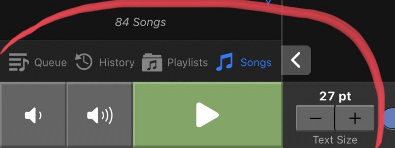
If you disable Advanced Queue mode, you don't need to worry about queuing. It is done automatically in the background for you.
The tab icons will be moved to the top in version 3.1. With this change the button layout (and size) is identical to version 2.
What do you mean with autoselect next song? This is working exactly like in version 2 with advanced queue mode off.
peter If you disable Advanced Queue mode, you don't need to worry about queuing. It is done automatically in the background for you.
Yes, i have disabled Advanced Queue mode, and i have not problem with this
peter The tab icons will be moved to the top in version 3.1. With this change the button layout (and size) is identical to version 2.
This is good news. But one more thought - volume buttons and slider do exactly the same thing. Why duplicate tasks and spend space on it? Just a slider wouldn't be enough?
peter What do you mean with autoselect next song? This is working exactly like in version 2 with advanced queue mode off
Yes, i know it's similar to the previous version, and I had the same wish for the previous version also. As I said, I play songs from the song list, but often I don't play songs in the order they are. While one song is performing, i scrolling list and think about what to do next. And in that situation it is annoying if the list automatically jumps to the next track when the current track ends
John This is good news. But one more thought - volume buttons and slider do exactly the same thing. Why duplicate tasks and spend space on it? Just a slider wouldn't be enough?
During the beta testing of version 3, there have been complaints that I have omitted these buttons. Personally I also don't understand why you need a slider and the buttons. But there have been a number of complaints that these buttons need to be there.
John Yes, i know it's similar to the previous version, and I had the same wish for the previous version also. As I said, I play songs from the song list, but often I don't play songs in the order they are. While one song is performing, i scrolling list and think about what to do next. And in that situation it is annoying if the list automatically jumps to the next track when the current track ends
But when you tap on a song while playback is running, that song will be preselected as the next song. So why not just scroll down until you find your next song and tap on it? The current song will keep playing until the end and once ended, the selected song will be armed.
peter So why not just scroll down until you find your next song and tap on it?
Because I play the guitar at the same time and singing, I often don't have enough time to preselecting next song. And after the current song is ended I have to start scrolling again. And the audience is watching and waiting. Not good.