peter The text editor has no knowledge of your timestamp contents. So this request is nearly impossible to do.
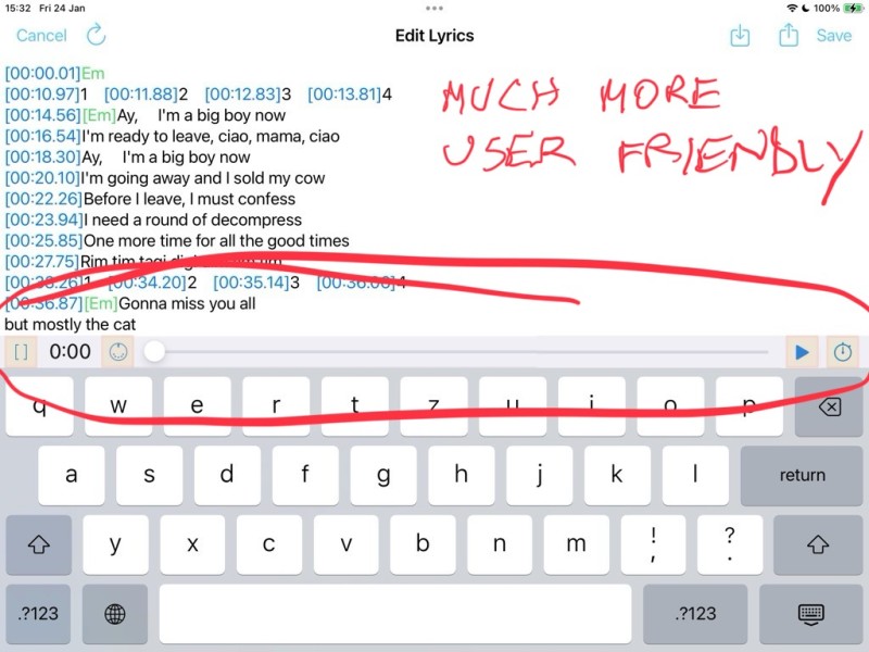
OK, heres another suggestion that might help, if you shift the time display to be at the extreme left side and as larger as possible this will bring this display much closer to the timestamps so you can see both at an easy glance , at the moment its on the far right and fairly small , the other thing i would shift is the PLAY button to be where the clock was right next to the time stamp button , this achieves another thing which was awkward if you needed to immediately start time stamp after play because its far away and very small it makes it much more user friendly , you tap play and right next to it is the timestamp button , this is much more practical , you virtually don't even need to look at that area as you hit play you know the timestamp button is right next door as you keep an eye on the clock that guides you to your next timestamp right above.
You can easily compare timestamps and clock cause they are very close together.
I think this would help improve the time stamping process which can get quite complex with some songs.
To add, after more thought, if the clock was slightly larger to match timecode size and was placed between the [ ] and midi button this would also eliminate accidental press of midi button which has happened on a number of occasions when continually needing the [ ] button, this gets used a lot when entering chords.
Also i would introduce buttons so we can instantly see the limit of the hit point , this also highlights the fact these are buttons meant to do something important if you click on them just like the old systems use to use , not like the new lame minimalistic way of giving us important function keys you need a manual to work out what they actually do.Be proud of your functions and make them pop out and slap the user in the face 😂
