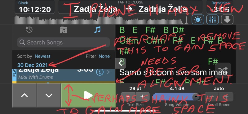
Hi Peter, i know there are limitations in what can be done but will point out some things in case things can be improved even slightly, because as it is is not very usable.
At least aligning the one song in the limited window is better than nothing.
The play button and that whole area could be a bit thinner and still usable giving more song list view which is very important when using ST3.
And perhaps the date information on iphone is less important than seeing song list, which at the moment is almost unusable.
I know you probably know these things already but i do rely on my iphone for my backup and want it to be usable if possible.
Cheers Damir
