This is not really specifically a V4 issue as it was the same in V3 but I thought I would raise it here in the hope it can be considered for a future V4 release.
The layout of lines in lyric text that are chords only, with no actual lyrics, don’t display well. In the app I have previously used for my charts, the display of lines of chord changes displayed pretty well, but ST is not so good.
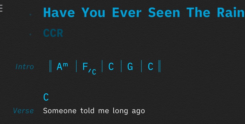
For example, the intro to a song with just music, no words, could be displayed in the previous app like this;

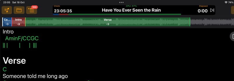
Whereas the same thing in ST looks like this;

Interestingly, the text from the above ST display looks better in editor than it does in the main display. The editor looks like this;

Not perfect but a lot neater than the main display version.
I am using fixed font, as suggested previously by @peter
I would love to be able to improve this if anyone has any ideas. If not, then can @peter say if this is something he would be prepared to look at in ST4 sometime. If so I would be happy to propose some ideas.
This would make charts so much more useful as I could chart out chord changes for intros, solos, breaks, outros etc, which currently is a real struggle.