peter Let’s talk about simplifying Layout on IPhone for easy use.
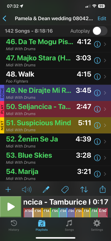
I like the fact all my on stage touch needs are at the bottom and I like the fact I can get to settings, playlists, history, song this is great , I don’t like the placement of edit functions and the loop section , I rather have the loop sections above the Stop button section and the edit functions not available till I ask for them as I don’t need them when performing , this is even more confusing as when you hit the edit button to left it changes this option completely

When I hit play , I would rather that the lyrics pop up as now but nothing changes in interface , the setting option remains at bottom the stop section remains and the loops section remain on top of that, so nothing jumps around the screen except you get your lyrics above, this greatly relaxes the user, if I want edit functions then I press edit and all my options are presented in one nice place most likely in my prep stage where I don’t need my lyrics or song selection,
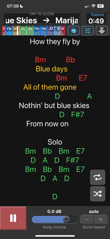
The area next to stop button should be your mix , loop, volume , pitch , speed , Edit functions where you can choose what you prefer in which order except the edit function to be permanent on opposite side of stop button , this area does not change in any mode , here is what you get when you hit play example

Loops jump to the top , that’s very confusing and unnecessary also now if you change loops you cover your lyrics big no no, the whole interface changes and slaps you in the face , why ?
When it could just remain the same and show the lyrics above and all necessary buttons remain at the bottom so no need to block your lyrics a quick swipe to left or right gets you the songs or back to lyrics so you can select next song when convenient, but all your function buttons are always at the bottom and nothing changes no matter what.
That’s it for now my fingers are getting tired 😂