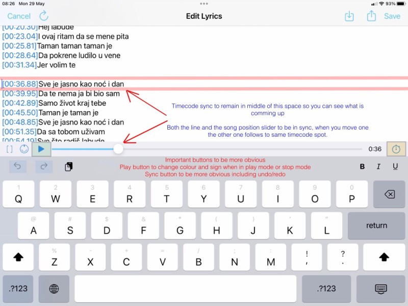
Hi Peter, here are some thoughts to improve and polish the operation of the edit window,
I hate it when I'm syncing timecode and the text line drops right to the bottom , it would be much better if it stayed in the middle of that screen space so you can see what is coming up, i also think the sync button needs to be a more definite spot to hit and obvious to the user just like the play button should be the same as the normal play button just smaller, this should be consistent throughout the whole app, and finally the undo/redo buttons definitely need to be spaced further apart and defined as i have numerous times mishit them , i would perhaps even shift them to the middle of that space to totally isolate them from accidental hits of other buttons around them.
It would be great if somehow you could make the positioning song fader also position the already time coded lyrics, that way you can easily slide the fader back and auto position your lyrics to the middle of the editing screen for immediate editing, it would save a lot of time.
Oh one more thing, having the name of the song you are on would be also helpful, when you walk away and come back later to be able to refresh your mind to what song you are working on without needing to exit to other windows.
Cheers Damir
